the platform
ACP started as Inskin Media's creative production studio. Formerly named ARC, this was where designers would build the creatives and where Ad-operations would set tracking and generate ad tags. ARC also had a second tool, Showcase, that housed every creative built by the company. This was used by the commercial teams to pursue leads and to pitch Inskin's products to clients or respond to briefs.
External agencies and publishers also used the tool as a self-serve service. They could build simple creatives using a templated solution and generate the tags themselves with no need for Inskin's intervention.

objectives
○ Rebrand tool to match the Azerion brand guidelines.
○ Turn the platform into the starting point for bespoke rich media creation across the wider business.
○ Prepare the tool to scale as the business expands.
my role
I was involved in the UX development stage to identify the interaction between the different tools of the platform and how the users would be impacted by the changes and implemented the UI changes inspired by the Azerion Ad-Tech Guidelines. I also aided in the development of new features and development of future templates to be released to the wider user base, both internal and external. I was also responsible for user onboarding and training.
branding
We had help from the central marketing team to change the branding of the platform as they were already familiar with Azerion's brand identity and guidelines. After settling on the new name, Azerion Creative Platform, they worked on a new logo and branding guidelines.
We wanted to use the ACP acronym to unify the experience of using the different tools. We would have ACP followed by the tool name, in this case, Studio and Showcase. If any other tool was added to the platform, we would follow the same pattern.
development
The original platform used exclusively Inskin Media's formats and technology, but we knew that for Azerion we needed to change it to be compatible across a range of formats and products that the company produced around the world. Given that every territory could be using a number of external tools to achieve this, we wanted to reduce the reliance on these tools and have a dedicated platform in-house to support our teams. We also knew that new formats could be added in the future, should Azerion acquire a new company that used something different. With this in mind, the tool needed to be flexible enough to accommodate new products.
We started with some native standard formats they offered in their DSP platform as proof of concept, with the goal being that any creative that needed a designer's touch would be built in ACP.
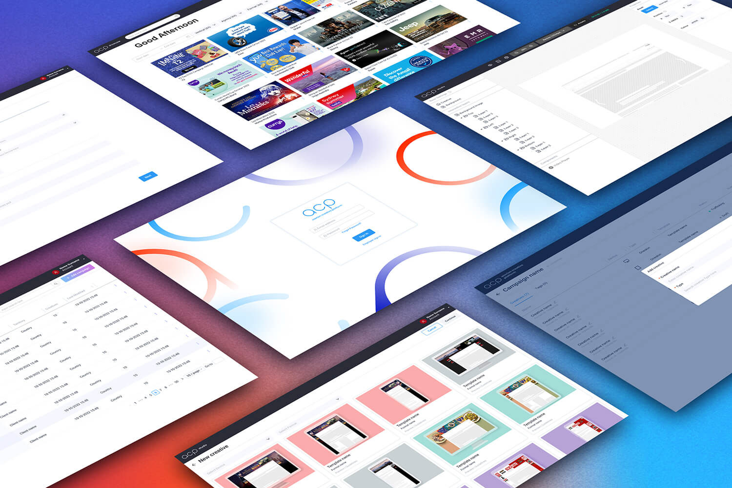
Because of this added complexity, the 2 original tools became 3. We then had Dashboard, Studio and Showcase. All 3 were independent of each other, allowing for faster development should we need to add new features or formats.
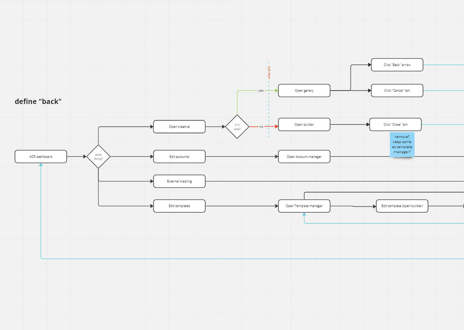
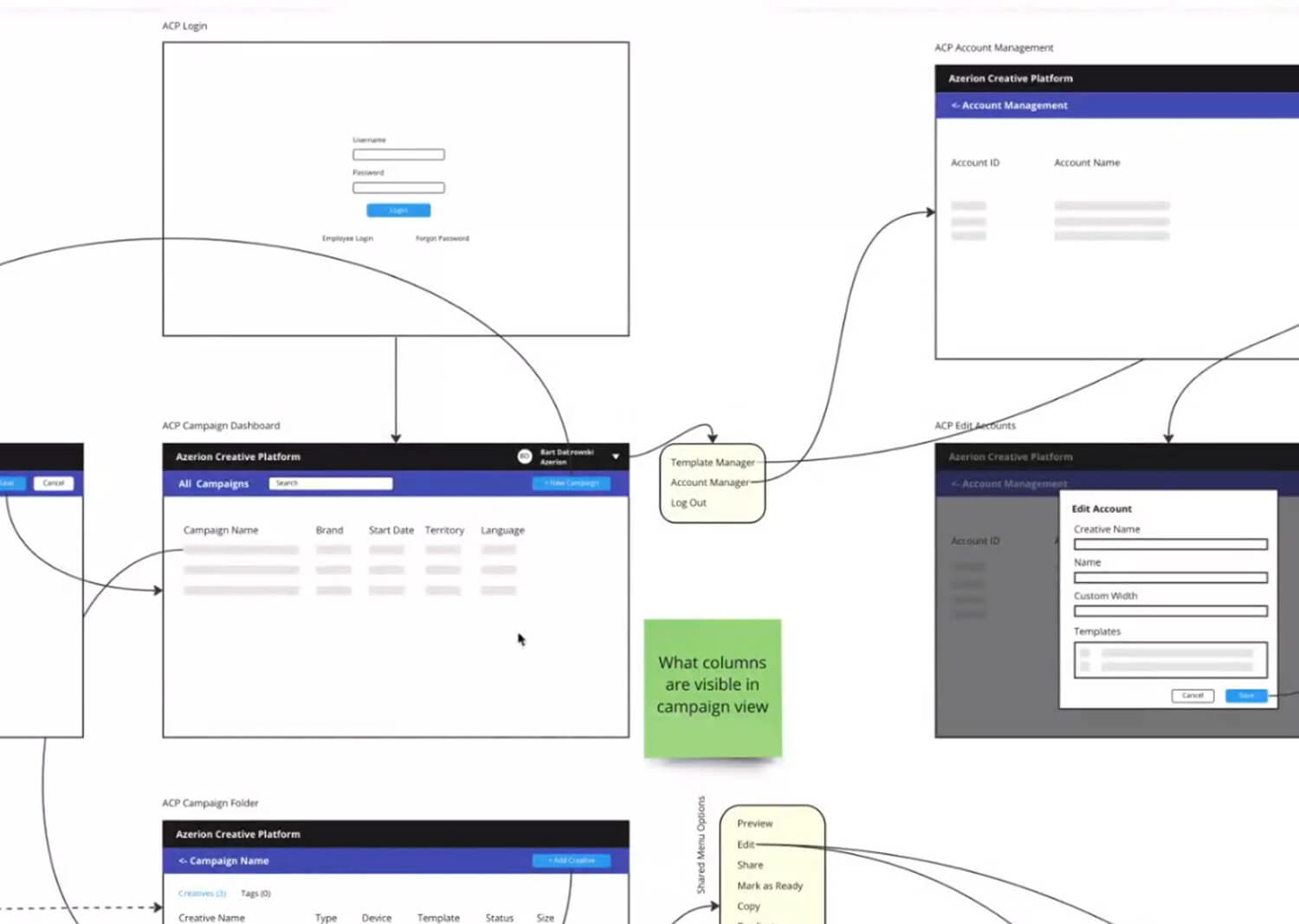
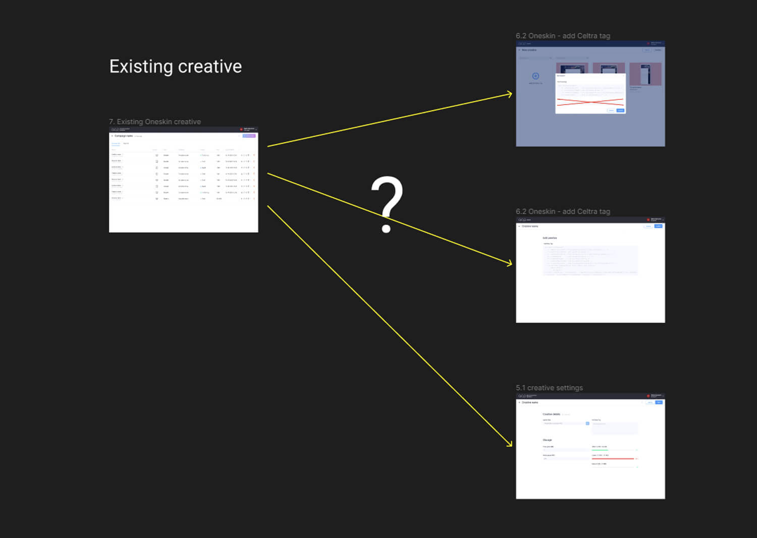
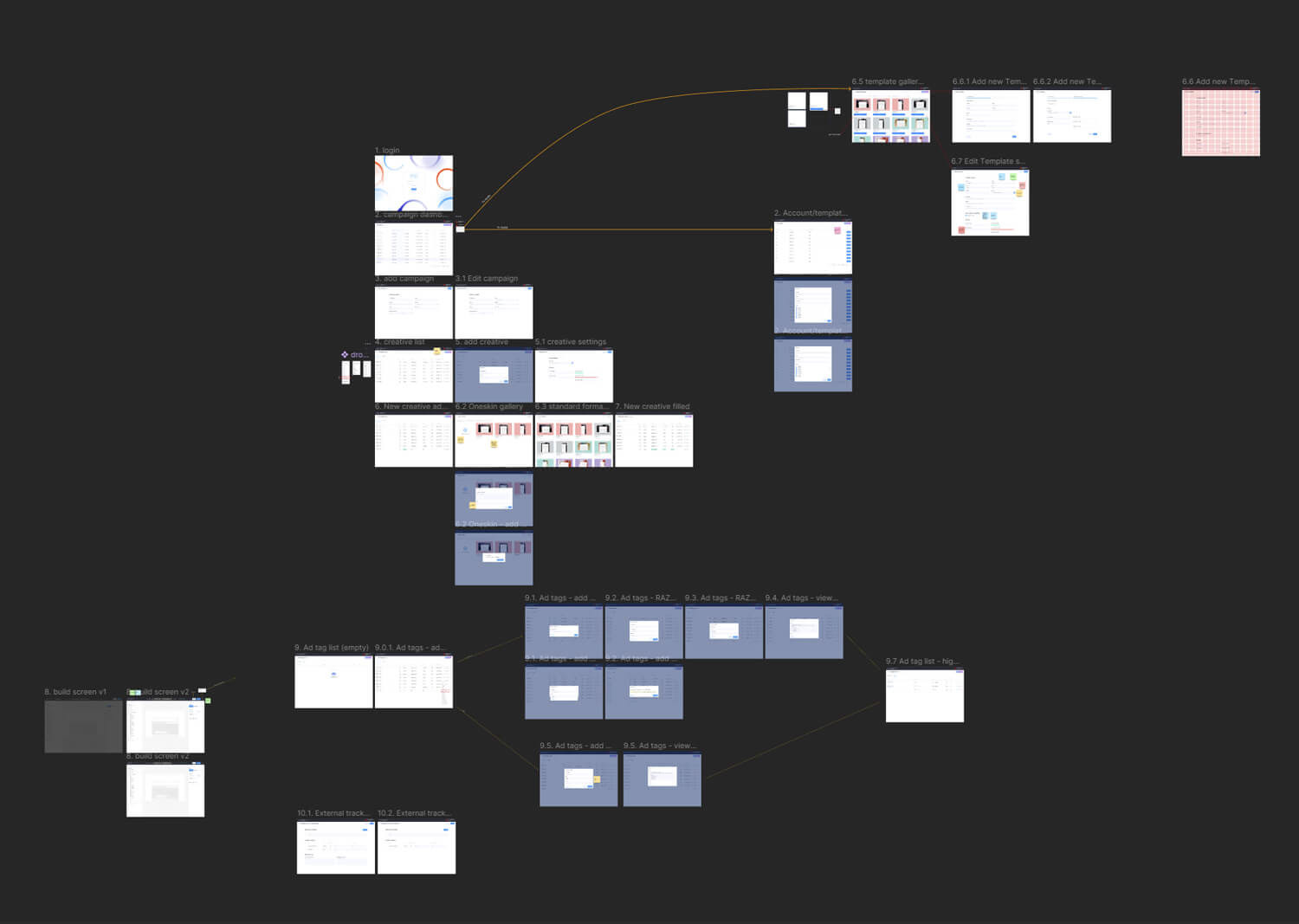
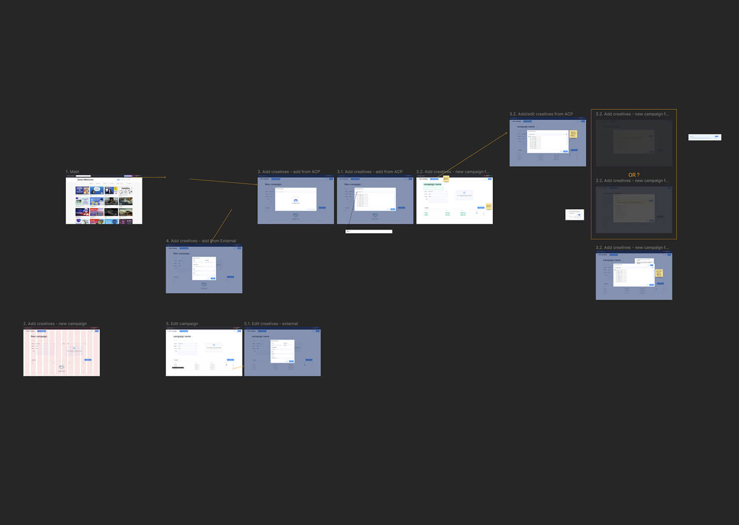
Together with the Product Owner, we broke down the existing features and assigned them to each one of the tools. We worked on low-fidelity mockups to identify what went where and to take them to both users and stakeholders to confirm or disprove our assumptions.
We also had regular discussions with the development team to make sure that the solutions were viable and to further identify where we could reuse or simplify screens.
Once the path was set, I would translate the mockups into high-fidelity designs and write down the specifications for the development team.
ui
The platform uses the Ant design component library and originally we left it at roughly the default values and colours. With the new branding, we wanted to change that.
Our UI designer was working on a unified Azerion Ad-tech Design System for the wider company apps so I took what was ready at the time and applied it to ACP. Given that we were working in parallel some of the final guidelines were directly influenced by the work done in the platform. This feedback enriched the UI guidelines to make them more polished and functional.
We used a blue-to-fuschia gradient for our accent buttons, guiding the user to the most important tasks in each tool such as Add Campaign or Add Creative. This breaks the sobriety of the design and hints at the playfulness a creative tool should have.
The overall look was cleaned up. I wanted to give it a cleaner look and remove the dull grey backgrounds that were part of the tool originally. The soft violet and blue accents provided a dash of colour to the design without being too overpowering.
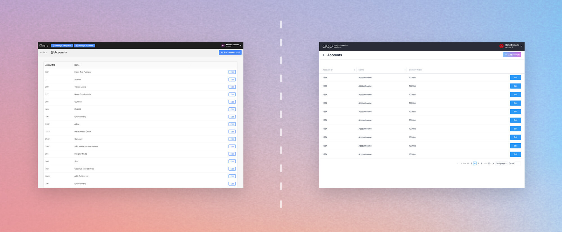
Some functionality was grouped in a neat user menu to clean up the top bar, where users with admin permissions would be greeted with a busy and confusing UI.
The search bar was also lowered to where it made more sense, closer to the content it was supposed to sift through.
The actions menu was simplified, with the most common actions being made available on every line item to streamline the user journey.
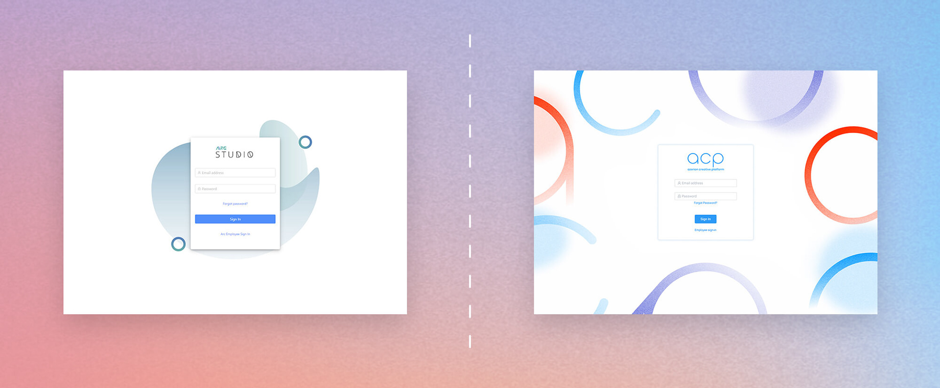
Before and after: login screen
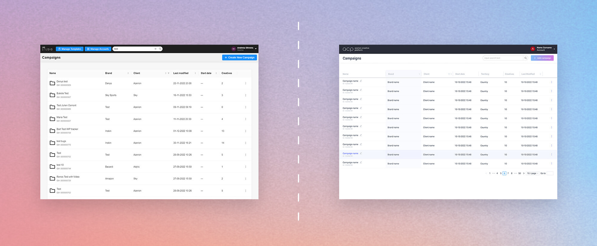
Before and after: campaign dashboard
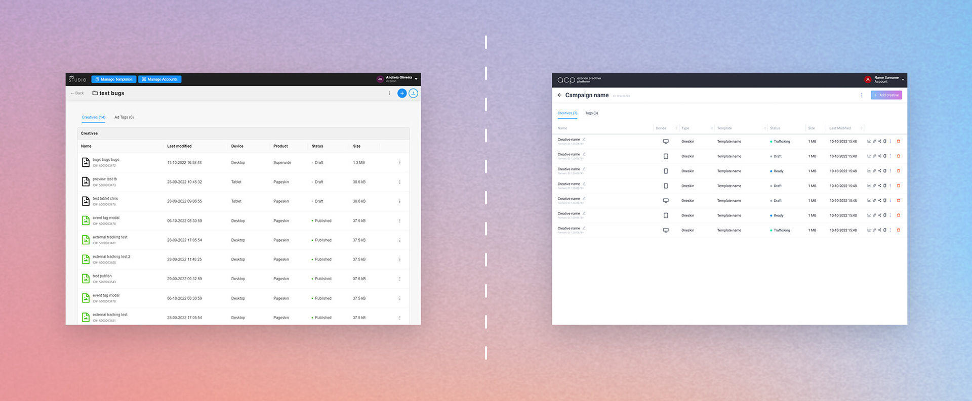
Before and after: campaign screen

Before and after: account management
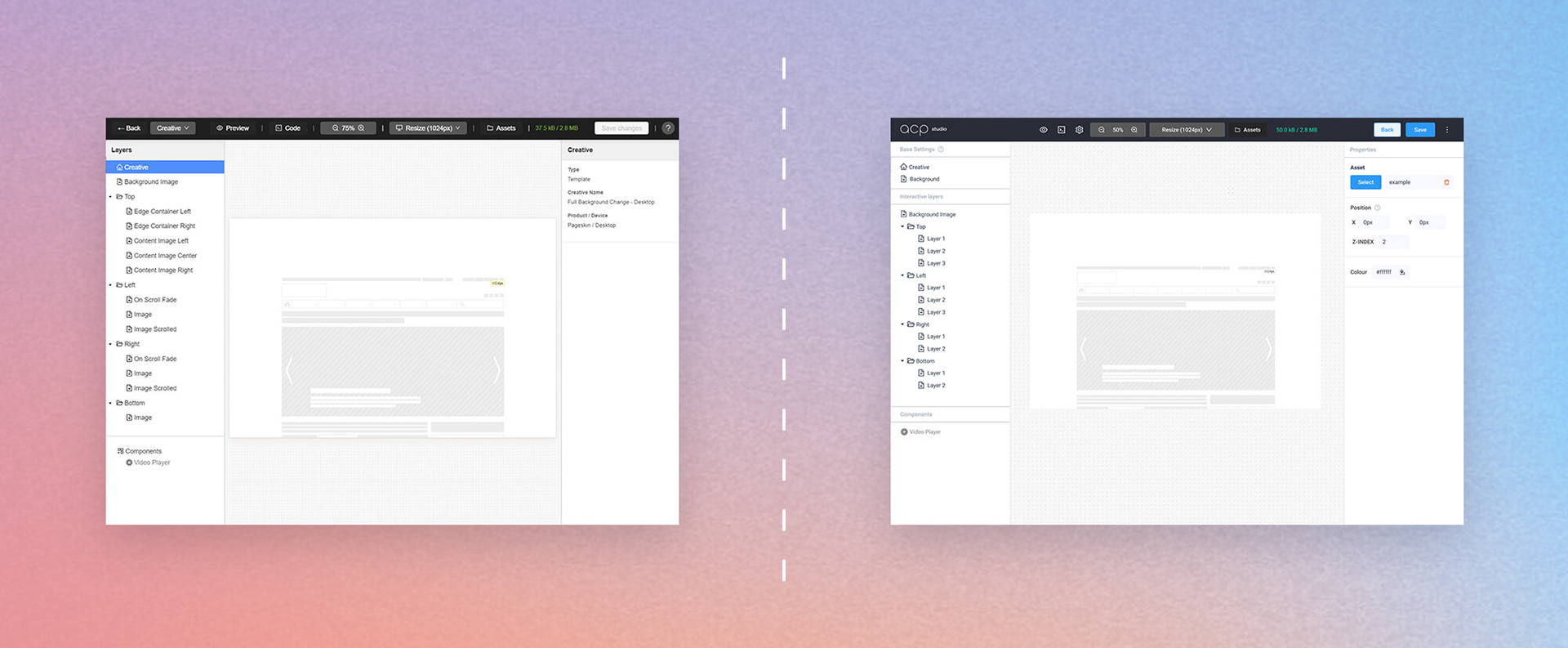
Before and after: creative studio
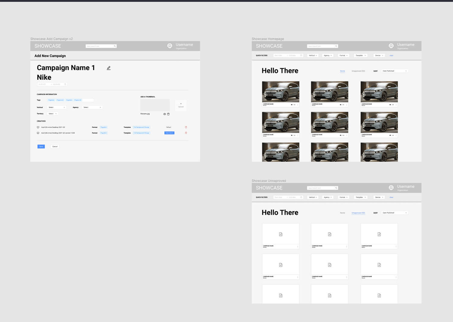
Before and after: Showcase