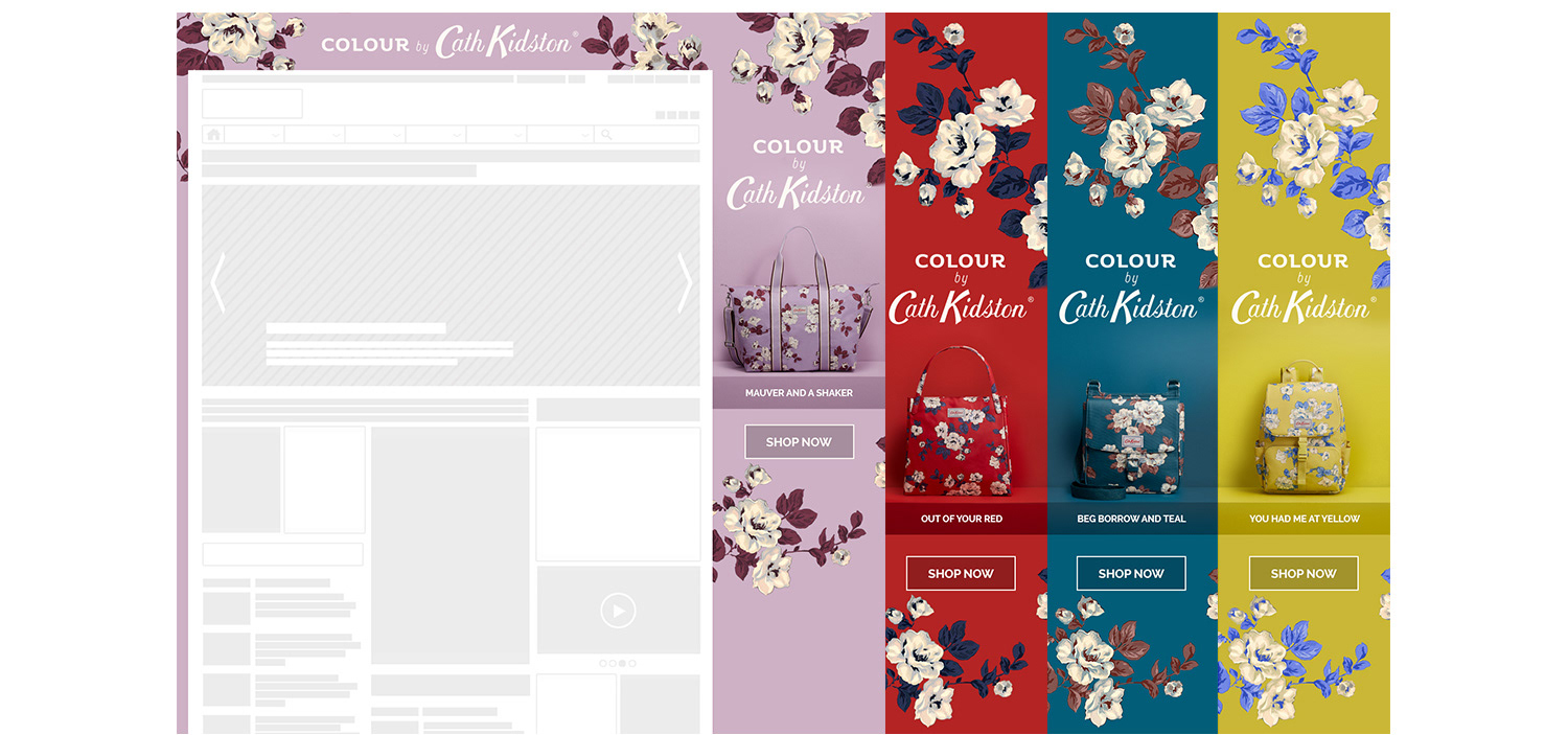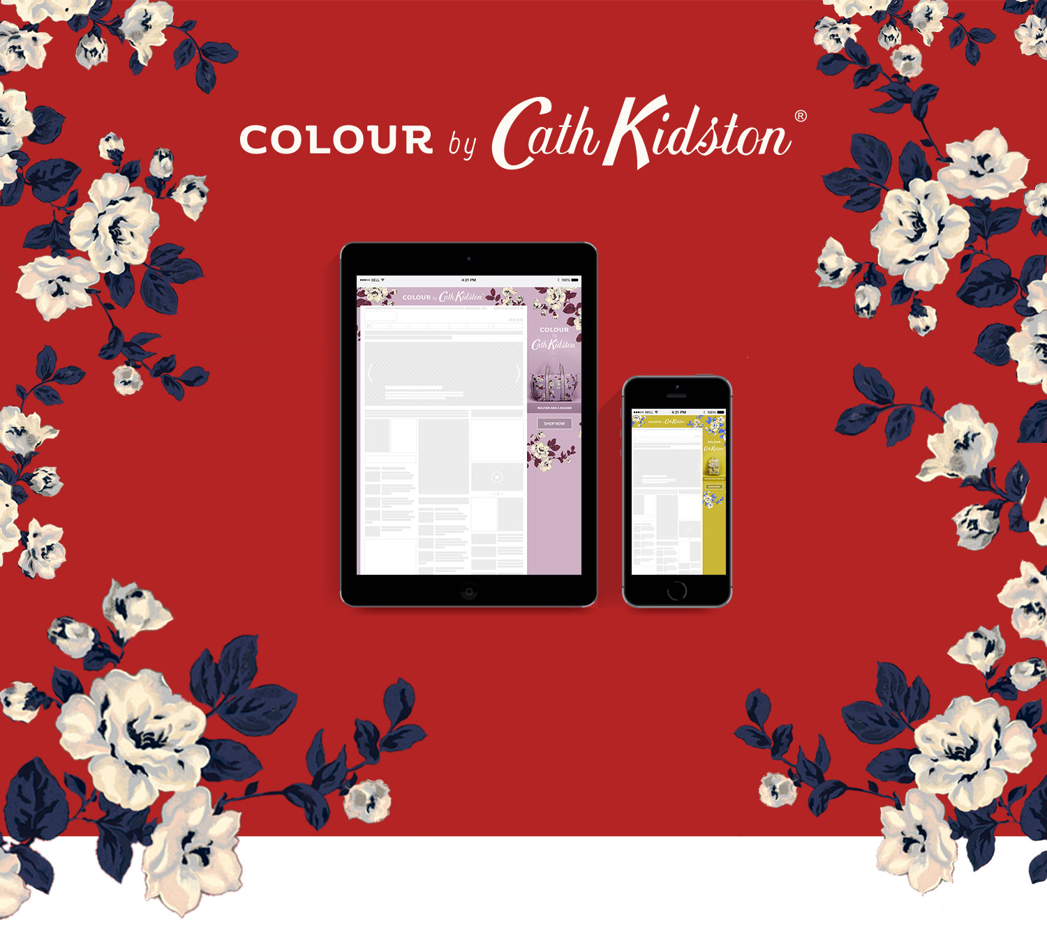
Cath Kidston approached Inskin with a clear look and feel for the campaign they were launching. The concept worked beautifully on print, with each product shot against a solid colour wall matching its colour. They were really set on the square wrapping for each product for this creative, but we thought that the imagery could be lost and lose impact if we did it this way. Plus, the background colour would have to be white to mimic the print ad. We thought we could push this in a better direction and they were happy to help us along the way.
The campaign was also tablet and mobile only. That meant that we needed to reduce the number of products we could use to keep the creative light.
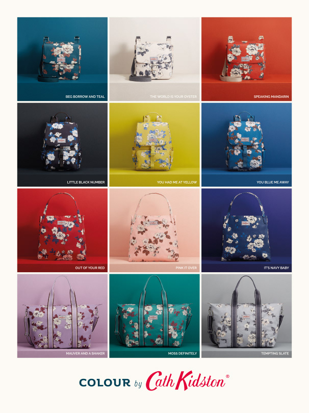
Cath Kidston's Print ads for the Colour Capsule campaign.
We had a solution that could keep both teams happy. We would match the creative background with each coloured wall. We scaled it down to 4 different products and we would change the colour and the flowered pattern to match the product. With each scroll, the creative would change seamlessly, an explosion of colour just as intended.